
Behance

By now you know I’m obsessed with design that just works, and Behance is exactly that. It’s a portfolio platform for creatives, and the website itself is a masterclass in showcasing visual content.
The grid layout immediately hits you with stunning creative projects—no clutter, no distractions. The designers understood that when you’re displaying creative work, the content should be the star, not the interface.
But here’s where Behance really shines: the filtering system. You can search by creative field, location, or even color palette. Imagine needing inspiration for a blue-themed project and being able to filter the entire platform by that specific color. That’s genius!
The project pages are equally well-designed. Large, high-quality images with plenty of white space let the work breathe. Navigation is intuitive—you never feel lost. What I really appreciate is how responsive it is across devices. Whether I’m browsing on my laptop or phone, the experience is seamless.
Behance proves that when you design with users’ actual needs in mind—discovery, inspiration, and easy navigation—you create something genuinely enjoyable to use.
Duolingo

Duolingo’s website is deceptively brilliant. At first glance, it looks playful and simple, but that simplicity is doing some serious heavy lifting. I honestly love this websisite because a learning website shouldnt feel too serious.
Let’s talk about their different mascot. They are everywhere, and it’s genius branding. Instead of boring photos, Duolingo built their visual identity around this character. It makes language learning—which can be intimidating—feel friendly and approachable.
The homepage is a masterclass in clarity. One main message: “The free, fun, and effective way to learn a language!” And one clear call-to-action button. No confusion, no overwhelming options—just straightforward guidance.
The onboarding flow is smooth. Click “Get Started” and you’re immediately choosing your language and setting goals. No lengthy registration forms—just straight into the experience.
Progress bars, achievement badges, streaks—they’ve made language learning stats exciting and motivating. The signature bright green is energetic and optimistic, exactly the mood you want when tackling something challenging.
Duolingo proves that “simple” doesn’t mean “simplistic.” Every design choice serves the goal of making language learning feel achievable and fun.
Dribble
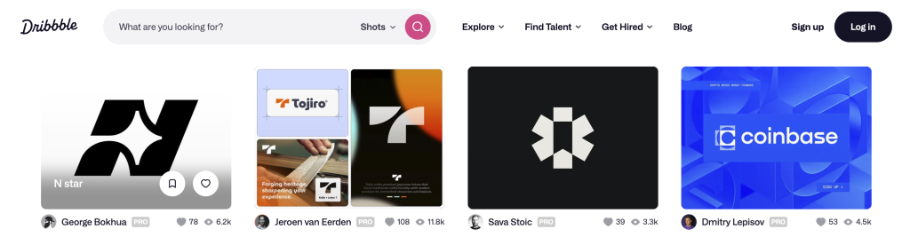
If Behance is about in-depth portfolios, Dribbble is about instant visual impact—and it does this brilliantly. It’s like the Instagram of design work, but even more addictive.
The homepage hits you with perfectly sized thumbnails of design work. Not too big, not too small—just that sweet spot where you can quickly scan hundreds of designs but still appreciate each one. That’s intentional design thinking.
The color search feature is brilliant. Need inspiration for a specific color scheme? Click the filter and boom—instant results. I’ve used this countless times when stuck on color choices.
The community aspect is handled well too. You can like shots, comment, and follow designers, but unlike chaotic social media, Dribbble keeps it clean and focused. Navigation is effortless with a simple top menu.
Dribbble understands that designers are visual people with short attention spans, so they created a platform that delivers instant gratification while maintaining quality.
Leave a Reply