
This article critically analyses the first version of the Black Crag website by examining its strengths and weaknesses. It also highlights the improvements made in the second version of the website. Black Crag is a fictional outdoor brand, and the primary goal of the website is to encourage users to visit the physical store.
Critical Analysis of the Original Site
Overall, I found the visual design of my website to be strong. I chose orange and brown as the brand colours to reflect an outdoor theme, and I think this successfully created a warm, adventurous feel. I also used simple and clear language throughout the site, which helped users scan information quickly and reduced confusion.
The website had a clear visual hierarchy, which I achieved by structuring content logically across each page. Key information and calls-to-action were easy to identify, which improved usability. I also maintained consistency in colour, typography, and layout, which helped strengthen the overall brand identity. In addition, I used white space intentionally to prevent clutter and improve readability. The site was responsive across different screen sizes, so it worked well on desktop, tablet, and mobile.
From a technical perspective, I structured the code using semantic HTML to improve accessibility and organisation. I also implemented Meyer’s Reset CSS to ensure consistency across browsers. Accessibility was considered through features such as keyboard navigation and colour contrast, helping the site align with WCAG 2.1 guidelines.
However, after reviewing the site and considering feedback, I identified several areas for improvement. One major issue is that the website still feels like an online store rather than a site designed to encourage users to visit a physical shop. Some calls-to-action, such as “Visit Us Today,” were too generic and did not clearly communicate the intended user action or support SEO effectively.
In addition, the layout of the gear page closely resembles a typical e-commerce site, which could lead users to expect online purchasing functionality. Another weakness was the absence of meta descriptions, which reduced search engine visibility and overall SEO performance.
Although I considered accessibility during development, I noticed some colour contrast issues on the homepage that could affect readability for certain users. This means the site does not fully meet best accessibility practice, and this is something I would improve in the next iteration.
Improvements Made in the Redesign
One of the main pieces of feedback I received from the first version was that the site felt too much like an online store, which was never the intended goal. I still wanted users to have access to detailed information about the shop, including the products available, services offered, and what they could expect before visiting. n the redesign, I made it a priority to address this feedback by changing the messaging, layouts, and overall look and feel of the site.
Calls-to-action such as “Explore Gears” from the previous version were removed and replaced with more experience-focused messaging like “You Can’t Get This Online” to reinforce the idea that Black Crag is a physical outdoor shop built around in-person experiences. The redesign focuses much more on expert advice, trying gear in-store, boot fitting, and the community aspect of the business rather than simply browsing products online.
Visual and Layout Improvements
For the overall design, I kept the orange accent colour from the previous version but introduced a forest green as the second primary colour to better reflect the outdoor and nature-focused identity of Black Crag.
I also updated the typography following feedback from the first version that original typefaces, Source Sans 3 and Roboto, were visually too similar. In the redesign, I introduced Montserrat for headings while keeping Source Sans 3 for body text. Montserrat gave the site a much stronger and bolder visual identity, while Source Sans 3 maintained good readability for longer content. The combination created clearer hierarchy, better consistency, and a more polished overall appearance.
I prioritised key information above the fold to ensure users immediately understand the purpose of the site and can access important sections without needing to scroll.
Technical Improvements
A major improvement introduced in the redesign was rebuilding the site using PHP. This allowed me to create reusable components such as separate header, navigation, and footer files that could be included across all pages. This made the site much easier to maintain, as updates only needed to be made once instead of editing every individual page manually.
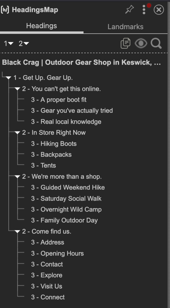
The use of semantic HTML was also considered much more carefully throughout the redesign. I paid closer attention to using elements such as <article>, <section>, and <figure> only where they were semantically appropriate, rather than using them purely for styling purposes. When a semantic element did not clearly fit the content, I used a <div> instead to avoid misusing HTML structure.
For the CSS, one of the major pieces of feedback I had consistently received was to explore selectors and combinators more deeply. This became a major focus in the redesign. I made much greater use of structural selectors, child combinators pseudo-classes throughout the stylesheet. This helped create cleaner and more efficient CSS while also improving my understanding of how to target elements more effectively.
JavaScript ON and OFF
For my use of JavaScript on the site, I implemented a feature that lets users know whether Black Crag is currently open or closed right at the top of the page. The script reads the current time and displays dynamic status updates to improve the user experience and make the website feel more interactive.
I also considered users who may have JavaScript disabled. The site was designed using progressive enhancement principles, meaning important information is still available even without JavaScript. The shop opening hours are manually written out in the location section, so users can still access that information if the dynamic status banner does not load. Similarly, the full shop address and contact details remain visible even if the embedded Google Map cannot be accessed. This ensures that key content and functionality are not dependent entirely on JavaScript.
Accessibility Improvements
Accessibility became a major focus during the redesign. Several improvements were introduced across the site: skip-to-content links, improved colour contrast, keyboard-accessible navigation, visible focus indicators, and descriptive alt text on all meaningful images — including team photos, which previously used a generic description for every person regardless of who was shown.
ARIA attributes were used throughout to communicate information that visual design alone cannot convey to assistive technologies. aria-current="page" is applied to the active navigation link so screen reader users know which page they are on without having to guess aria label for primay and footer navigation.
A dedicated accessibility statement page was created following WCAG 2.1 AA guidance, covering what has been implemented, known limitations, and contact details for reporting issues. Overall these changes significantly improved both the usability and inclusive quality of the site.


Search Engine Optimisation
One of the most important improvements I made was adding a unique meta description to every page, as meta descriptions are one of the most fundamental SEO requirements. This helped provide clearer summaries for search engines and improved the potential click-through rate from search results.
I also reviewed and rewrote all page titles to make them more keyword-rich and descriptive. For example, the original gear page title, “Black Crag | Gears,” was changed to “What We Stock | Hiking Boots, Backpacks, Tents and More — Black Crag Keswick.” This made the page more specific, improved keyword relevance, and better reflected the page content.
I also added a robots.txt file to tell search engines they can access the whole site and where to find the sitemap. I also created a sitemap.xml file that lists all the pages and shows which ones are most important. Together, these help search engines find, understand, and index the website more easily.


404 Error Page
I also designed a custom 404 page for situations where a user mistypes a URL or tries to access a page that no longer exists. The page was designed to reassure users that they are still on the Black Crag website by keeping the same header, navigation, branding, and footer used throughout the rest of the site.
Clear call-to-action buttons were also included to immediately guide users back to important areas of the website, such as the homepage and gear page, helping reduce confusion and improving navigation recovery.
Conclusion
Redesigning Black Crag brought together everything I have learned throughout this course. The original site looked reasonable on the surface, but rebuilding it revealed the importance of how much sits beneath the visual layer like accessibility, SEO, semantic code, and maintainability all need as much consideration as the design itself.
Leave a Reply